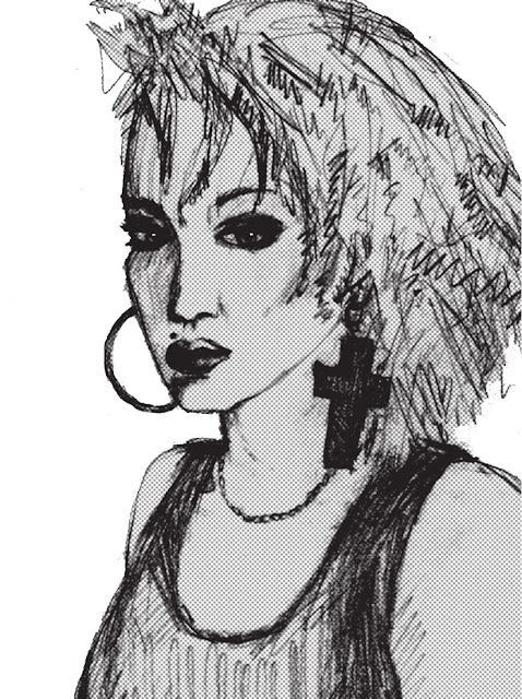
A straightforward sketch wasn't quite enough for me, especially as it kind of looks like Madonna but also kind of doesn't. So I created the following text, drawing by hand and colouring in black fine line.

The next stage was to scan the images and work on them in photoshop to create images which will print well. I used a halftone filter on the sketch and liked the way it picked up a tonal range instead of being a pure black and white image.
And I thought the two designs looked good together like this...

But as most of our screens are rectangular, it would have been too small, so we shifted the text to underneath the image and this is the finished result:


No comments:
Post a Comment